


Tomkun
-
Posts
378 -
Joined
-
Last visited
Content Type
Forums
Events
Downloads
Store
Development Tracking
HyperCL
Posts posted by Tomkun
-
-
Hopefully there's another version of the Civilization logo I can use, but whilst looking I noticed that the Amiga version logo differed from other versions so I won't hold my breath. Otherwise I'm gonna hold out until I have a lot of free time to do it. It looks to be beyond my skill/patience threshold at the moment.
-
Yeah, I thought as much. The "Zone" part of Dreamzone actually is a redraw, so that shouldn't take too long. How does one go about redrawing something like the colonization logo?
-
Also i would say if it is possible to do a full redraw rather the cutting out and cleaning, this would be better, is does take longer and cant always be done especially on complex ones but they do look so much nicer in my opinion
If you find one already done that you are not happy with my all means submit a nicer redrawn version, no one should be offended by this were just trying to get the best we can find.
Thanks For all the help guys
No offense taken; I can't wait to see them.
-
I did this one for c64:

That's much nicer than mine, do you mind if we use it?
-
 1
1
-
-
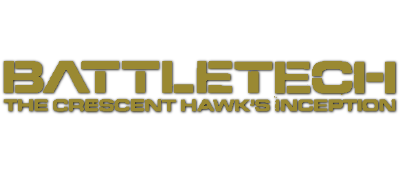
Nice one. I'm going to redo the BattleTech one though, I'm not really happy with it.
-
Champ_v1.0
-
1
-
 1
1
-
-
Battletech_v1.0_1402
-
1
-
1
-
-
Colonization_v1.0_AGA_0452
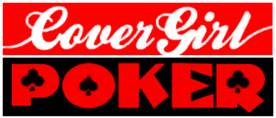
CoverGirlStripPoker_v1.1
DreamZone_v1.0
-
1
-
1
-
-
So... Are these good enough to be considered for the official ones? Can I mark them off on the spreadsheet and should I upload them somewhere else?
-
Yeah, it was easier to see the texture before I shrunk them down. You can still see it a bit on the bottom of the "II". I guess it's not meant to be there though, so it's a moot point. Most of my scans come from when I used to contribute to EmuXtras. I haven't done so for a long time, but I kept all my sources in case I ever took it up again. It doesn't make a lot of difference to wheel art, but none of them are watermarked, so that's nice.
-
WWFWrestleMania_v1.0_0205
-
1
-
-
XR35_v1.1_0034
-
1
-
1
-
-
Geisha_v1.3
-
1
-
1
-
-
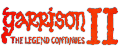
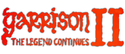
I had a go at "Garrison II", but I can't tell from the scan I have if the texture is meant to be there, or if it is a compression artefact. I've done two versions, one with and one without the texture.
Garrison2_v1.0_0610
-
1
-
1
-
-
OK, as promised, here are new versions.
Cadaver&CadaverThePayoff_v2.2_0900
CastleOfDrBrain_v1.0_1287
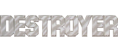
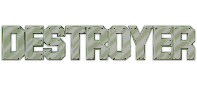
Destroyer_v1.0_0318
-
1
-
3
-
-
Let me know what missing boxes you need. I have access to a lot of them through another project I was working on, so I may be able to help you.
-
I understand. I will use white, then. I will also redo Destroyer. Thanks for the tips!
-
I am obviously using different source boxes to you! I took the colours from this one:
I can change it to white if you prefer, but I think this colour looks more attractive. Again, the Destroyer source I used was much darker than the one you have posted here. I also adjusted the contrast to show more detail. I think your version looks better though, so I will redo that.
-
Never mind, I figured it out. Anyway, here is my first attempt at a wheel for Cadaver & Cadaver - The Payoff.
I am quite pleased with it, but I am sure it can be improved.
I drew the main title from scratch using the boxart as a guide. The subtitle I took from the wheelart for the standalone version of the payoff. I hope that's not against the rules. I took out the red highlight and replaced it with grey. I also added a dropshadow to make the white text stand out on a pale background. I had to add the ampersand, but I think I got it pretty close in style.
Edit:
Another go at a different game. The Castle of Dr. Brain.
This time I had to remove the background and a knight's gauntlet from the foreground. I couldn't think of a decent way to terminate the bottom edge (on the box it seems to go to infinity, so I made it fade out. What do you think?
I'm rather enjoying this.
-
1
-
2
-
-
Thanks, Torden.
Do people use file sharing sites for uploading their artwork, or does Hyperspin have its own upload place? I want to be clear I am not submitting these yet, just looking for pointers until I am confident enough.
-
Where can I find the requirements for artwork? I mean resolution, dpi, dos and don'ts etc?
Also, when I have finished them, do they need to be checked? How can I upload them for evaluation?
-
Hello. I have come to offer my services such as they are. The Amiga was my first system as a kid, so I would like to volunteer here. Is there anything I can be getting on with?
-
1
-


Amiga WHD Load Artwork
in Wheel Art
Posted
Another attempt. Complete redraw.
DreamZone_v1.0
Did anyone else find another Colonization wheel? Can I have access to the vault to check for duplicates?