About This File
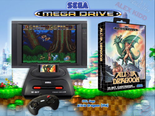
Inspired by a few themes out there a few months ago I created a Mega Drive 2 theme incorporating the cart going into the system.
I also went through for my self and renamed box art to suit USA roms for mega drive box scans and a limited amount of carts I could find, which was a bigger undertaking than you would expect given the many name changes for releases. I then realised after that no one seems to have put together a euro mega drive cart art collection (if you know of anywhere to find one let me know) otherwise it's something i'll look into in the future if I have time.
I realise this is imperfect and impure solution, but basically i'd like to have my cake and eat it too - using the USA versions of roms with the European (specifically Australian in my case) artwork. As i've renamed the artwork I've kept a list with titles that were renamed for Euro/NA release with an intention to later edit the xml to show both the USA and EUR release names.
So yes this "project" is sort of half complete at this point, ultimately there is still majority genesis cart art sliding into a Mega Drive 2 which is annoying (although many carts are indistinguishable of region when they are in the system so it's not noticable), but I figured I would share now while I have some time in case this is valuable to anyone.
Another option is to just use the theme without cart art if you prefer. I changed the size of my cart art to 142*94.
Carts and box art now included.
Artwork 2 folder for boxart and Artwork 3 folder for cart art.
Here is the game text colour and location information, paste this into the [games text] section of your settings ini file if you would like it to match the image. I don't use the default special art so you won't find much room left here for it. Feel free to edit to your own tastes.
\
[Game Text]
game_text_active=true
show_year=true
show_manf=true
show_description=true
text_color1=0x0061A8
text_color2=0x0118B3
stroke_color=0xffffff
text_font=Style3
text1_textsize=18
text1_strokesize=6
text1_x=480
text1_y=655
text2_textsize=25
text2_strokesize=6
text2_x=440
text2_y=680
\
*Edits - I've included my own cart pack which is sized down to suit the theme and filtered from some cart packs here on the site so I just wanted to credit those below.
- Re-uploaded this theme into the correct section and separated it from the Main Menu theme. This was one of my first uploads and I failed to put stuff in the correct place so I'm correcting that now. You can find my Main Menu theme linked below.
- Added renamed and resized Mega Drive boxarts, see the version notes below for details. Copy the provided box arts into your Artwork 2 folder and overwrite any existing Genesis art. You will need to find genesis box art for the boxes not provided.
- Added a newer brighter theme as an alternate and changed the header to MD 2 style logo.
What's New in Version 1.0.5
Released
1.0.2 -
Fixed the tv with a strip on the bottom edge so it appears the video is correctly on the tv.
1.0.3 -
I've added my Mega Drive box art European preferenced and then Japan, renamed to Genesis conventions. These have been pulled from 3 different packs I've found. It was a while ago that I put this together so I don't know for sure who to credit I think the main pack is from @SubZero, also I pulled some of this randomly off the ftp. I have resized for consistency and to suit the theme. I can't vouch for accuracy.
I have no idea how complete this is as I don't know how many of the Genesis titles where never actually released outside of NA, but this is as much as I could find.
Again remember that the names have been modified to suit the USA roms, so that is why you will find differing box art titles to game text because in many cases games were renamed for release in different regions usually for copyright or marketing reasons.
PAL titles generally run slower than the NA versions due to the tv standards of the time being different, for this reason usually the NA version of a game is the superior title unless it was developed in Europe to begin with. So what I am doing here isn't correct or accurate but mainly for nostalgia and practicality. While I would prefer to see the system and box art I have nostalgia for, there is no point in this day and age to play the sub-standard version.
1.0.4 -
I've noticed while working through fixing the genres that about 20 or so of my wheels are getting lost in the black background. I've added a small white border to them and uploaded them to share in case anyone is having similar issues.
I've also adjusted my recommended game text position and size a bit smaller and to the left so as less of the longer titled games are running off the edge of the screen.
1.0.5 -
I've always felt the theme was a bit dark so spent some time today editing it to suit a brighter green hills zone style background which I found in a theme made by @williecoiote. The change in background makes the theme work more as a companion to the style of my PAL Snes theme. I also changed the header to a Mega Drive 2 style logo to suit the console.
The original is still available if you prefer.
I've adjusted the text size and position to suit the background.
\
text1_textsize=18
text1_strokesize=6
text1_x=540
text1_y=655
text2_textsize=22
text2_strokesize=6
text2_x=510
text2_y=680
\


