


SupraKarma
-
Posts
1,274 -
Joined
-
Last visited
-
Days Won
16


About SupraKarma

Recent Profile Visitors
8,355 profile views


SupraKarma's Achievements
")


-
(TranslatedEn).thumb.png.ddfb3009ae76b898fc822bfe28b46625.png) Great work Aorin, the logos look nice.
Great work Aorin, the logos look nice.-
- 1
-

-
Version 1.1
106 downloads
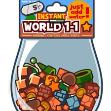
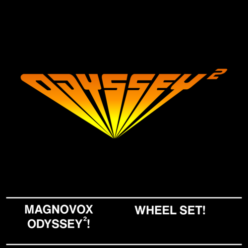
I noticed that most (almost 2/3s) of the games in the Magnavox database use only a few fonts on the box art (Arial Bold, Helvetic Now Text Medium being the most prominent), and was surprised to see that nobody has put together anything authentic in the way of a wheel set. I tentatively use the 'HQ' expression, there were a couple of wheels that came from poor sources. I did the best I could with them (I am a weekend warrior, not a pro), and overall I am happy with what I've created. Accuracy was my highest priority. Most of the wheels are quite large (only 15 are less that 800 pixels wide), and as far as I can tell it doesn't slow down HyperSpin at all, since most of them are just plain text, and one color. So, I don't recommend resizing them, why sacrifice quality if you don't need to? That being said, I included a folder with 400x175, if you must have it. -
.thumb.png.e77701bc877a660614bb4eeb03008243.png)
Version 1.0.0
65 downloads
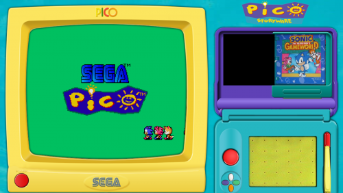
There are quite a few Japanese Sega Pico 'storyware' titles, as well as other countries, but this set is all of the ones that I am aware of that are playable in English. Not much point in playing any of them if you can't read them. Enjoy. -
-
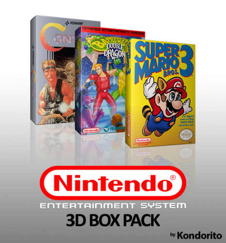
Nintendo Entertainment System - 3D Boxes [HQ Hi Res] - Complete
SupraKarma commented on Kondorito's file in Media
 Nice work @Kondorito, they look fantastic.
 -
-
Version 1.0.0
95 downloads
A collection of 976 2D box arts for NES. May contain some duplicates. Contains a high number of hard to find artwork for unlicensed games and prototypes. Also, a custom database that I am using to go with it, since many games are not in the official database - only 16 games are missing artwork, and 10 of those are prototypes. There are a handful of Famicom and FDS games in there. Use it or don't, I'm providing it as a convenience. I decided to go ahead and upload my wheels too, since I created several from scratch, and updated some from the FTP set that were incorrect. All games in the database have wheels at least. -
NEC PC Engine - 3D Jewel Cases [HQ Hi Res] - Complete
SupraKarma commented on Kondorito's file in Media
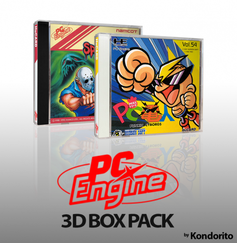 Beautiful!
- 6 comments
-
- 1
-
-
- if you are reading this you are awesome
- set
- (and 7 more)
-
Version 1.0.0
152 downloads
I decided to make a fade screen out of the work I did for the pointer. -

Version 1.0.0
80 downloads
This is supposed to look like the Nintendo Vs. Unisystem arcade cabinet side art: I spent way too much time on this, and it didn't even turn out as good as I'd hoped, but meh. Here it is if you want it. I've included my .psd files (they're a mess) if anyone else wants to work on what I was. -
Version 1.1.0
105 downloads
Tonesmalone had this uploaded over at the RocketLauncher forums. While perfectly fine as it was, I have OCD and reworked it to suit my own needs (namely, I cleaned up the artwork a bit, resized the main window, and took great care to get all 3 windows to fit pixel perfect). Also included is a new 'pad.png' file for the PicoDrive emulator, to replace the default artwork. It's nothing fantastic, I just took what was already there and cleaned it a bit and skewed the perspective so that it looks right. Lastly, I've included a user function for RocketLauncher that will move the mouse cursor out of the way while your fade screen is happening, then once the emulator is loaded, it moves the cursor squarely in the middle of the pad artwork, where it should be. -
Super Nintendo Entertainment System - Genres Fixed - Database (XML)
SupraKarma commented on Rowr14's file in Databases
 Excellent work. I may add this to my personal setup.
- 4 comments
-
- 1
-

-
- snes
- ultimatesnes
- (and 1 more)
-
Version 1.0.0
55 downloads
A 'Console Hacks' wheel I made using the 'Pretendo' font in a faux Nintendo logo, and the word 'Hacks' made from SNES letters I made myself. Enjoy.-
- 4
-
-
- main menu
- console hacks
- (and 1 more)
-
Version 1.0.0
246 downloads
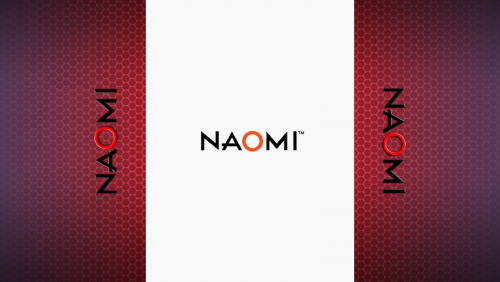
Have you noticed that some of the vertical games for Sega Naomi look terrible stretched out (even to 4-3 aspect ratio)? Well, this is an attempt to address that. If you have bezels turned on in RocketLauncher, and set the aspect ratio to 'stretch' in the Demul module, it should display correctly for vertical games with this bezel. So far, I've only tested a few games. Here's a before and after: As you can see, in the 'after' shot the Naomi logo doesn't look distorted. When I was tweaking the display, I simply compared a Naomi logo (with the correct aspect) with a screenshot, and I made adjustments until it was close to perfect. (note that I cut out part of the bezel to make sure the sides are lined up properly). So while I am not entirely sure if this is 'perfect' vertical aspect, Demul has no setting to do so, and this was a trial & error attempt at improvement. I've updated the files, and figured out all (I think) of the vertical games. All you will need to do is unzip this download into your \RocketLauncher\Media\Bezels\Sega Naomi folder.- 1 comment
-
- 8
-
-
-
- naomi
- rocketlauncher
- (and 2 more)
-
![More information about "Super Nintendo Entertainment System - Realistic - 3D Boxes [HQ Hi Res] - Complete"](https://hyperspin-fe.com/siteuploads/downloads/screenshots/monthly_2017_10/59eca62edadfa_ActRaiser(USA).thumb.png.e05472f8efbe5dabea1cc3091590a39c.png)
Version 1.4.0
2,219 downloads
When Kondorito and I started on this set, we had decent source material to work with - but the boxes were aged, rough, and somewhat worn. We proceeded to crop fronts, sides, and bottoms (in case we wanted to go a different direction), and we began to realize... these worn boxes didn't look *that* bad. In fact, they looked like they could realistically be a part of someone's actual collection (because they were, in fact). Personally, when I determine a box's overall condition when shopping on ebay, I have an idea in my mind of what is acceptable condition. If the box is a solid B, I'll buy it. The same principle applies here - if the box was a B or better, we didn't bother airbrushing them. To us, there is a certain charm to an age worn box. Not to mention, we also concurred that spending hours making the blacks pitch black, whites whiter-than-white, the colors too vibrant, airbrushing all dust specks, etc. was not the direction we wanted to go. Of course the argument could be made that we just didn't want to put forth 10x more effort into making them look perfect. And there's some truth to that, at least for me. But it was a solid 120 hours of work on my end (at least), plus however long it took Kondorito on his end of things. I'm glad it's done, I'm satisfied with the less than perfect result, and I have no plans to improve on it. Beauty is in the eye of the beholder. This set isn't for everyone. If you want a perfect looking set, look elsewhere. However, if you like the 'realistic' look, I think you'll be quite happy with this set. Many of the boxes look like actual photos - the cardboard looks realistic, and the wear and the dust adds to that effect. Enjoy.